Achieving quality printing can be easily obtain, just follow these five easy steps:
- Pay close attention to the details.
 Quality printing requires a high attention to detail. Don’t forget to proofread and spell check! Ask somebody to proof read for you as typos and spelling mistakes will be embarrassing.
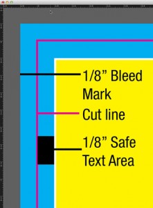
If bleed is required allow for 1/8″ (0.125″) all around it. Any printed piece requiring die cutting should include die lines to ensure the proper cuts and scores are made. Nexpres effects such as Gold Solutions, Textures, Glosses; as well as Foil stamping, embossing, varnishes and coatings also have unique design requirements in order to complete the finished product. If you are unsure of what it takes to set up your job properly for printing, don’t hesitate to contact City Press Ltd., as our friendly staff can easily guide you through specific requirements before sending us your files to eliminate any delays on production time or additional production costs. - Select the proper colour mode for your files
Whether using InDesign, QuarkXpress, Illustrator or Photoshops make sure to choose the proper colour profile for production. If your project will get printed in spot colours or CMYK or a combination of both then make sure that is the colour profile your have chosen. You should not leave your graphics as RGB as they may not translate well to CMYK. Make sure to make the colour profile you will be using clear when asking for an estimate and submitting your file. - Resolution is very important on your raster images
For images that are produce in Photoshop or similar graphic programs such as “.psd”, “.tiff”, “.jpg”, etc . Higher input resolutions produce better final results. If you send a low resolution file your print job will look fuzzy or grainy. Too high of a resolution may also produce grainy or inaccurate results. The ideal resolution of any raster file should be at 300 dpi at the size it will be printed. Vector images are resolution independent, they will be able to be enlarge as much as you desire and still remain sharp and clear. - Include all your fonts.
 When packaging your files for printing make sure to collect or provide all your fonts. Files without embedded fonts may produced inaccurate results. If working with Vector graphics from a program such as Adobe Illustrator make sure that ALL fonts are converted to outlines, otherwise font substitution may occur.
 - Font Size and weight Matter.
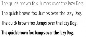
Keep in mind the font family you are using however body text should not be smaller than 10 pts. to make it easy for your audience to read; and as a Rule of Thumb you should NOT use text smaller than 5 pts. such tiny text may disappear. However if using an Ultra Light Font you should consider that the lines are much thinner and will become illegible at a larger size.
Share
21
DEC
2015
DEC
2015
0
